Давайте поговорим?
Расскажите о проекте, который хотите сделать и будьте готовы к нашему звонку или письму в самое ближайшее время!
Ваша информация охраняется Законом о защите персональных данных. Отправляя форму, вы подтверждаете, что согласны с тем, что мы получим и запомним всё, что вы напишете.









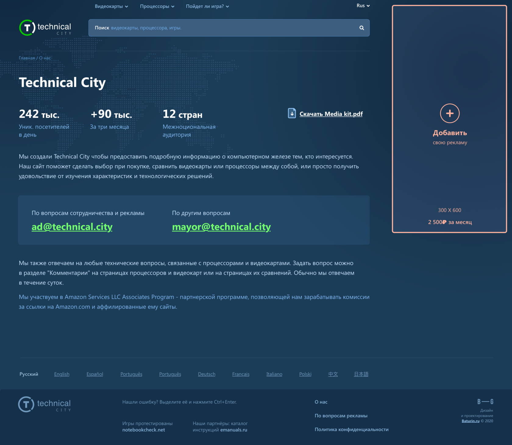
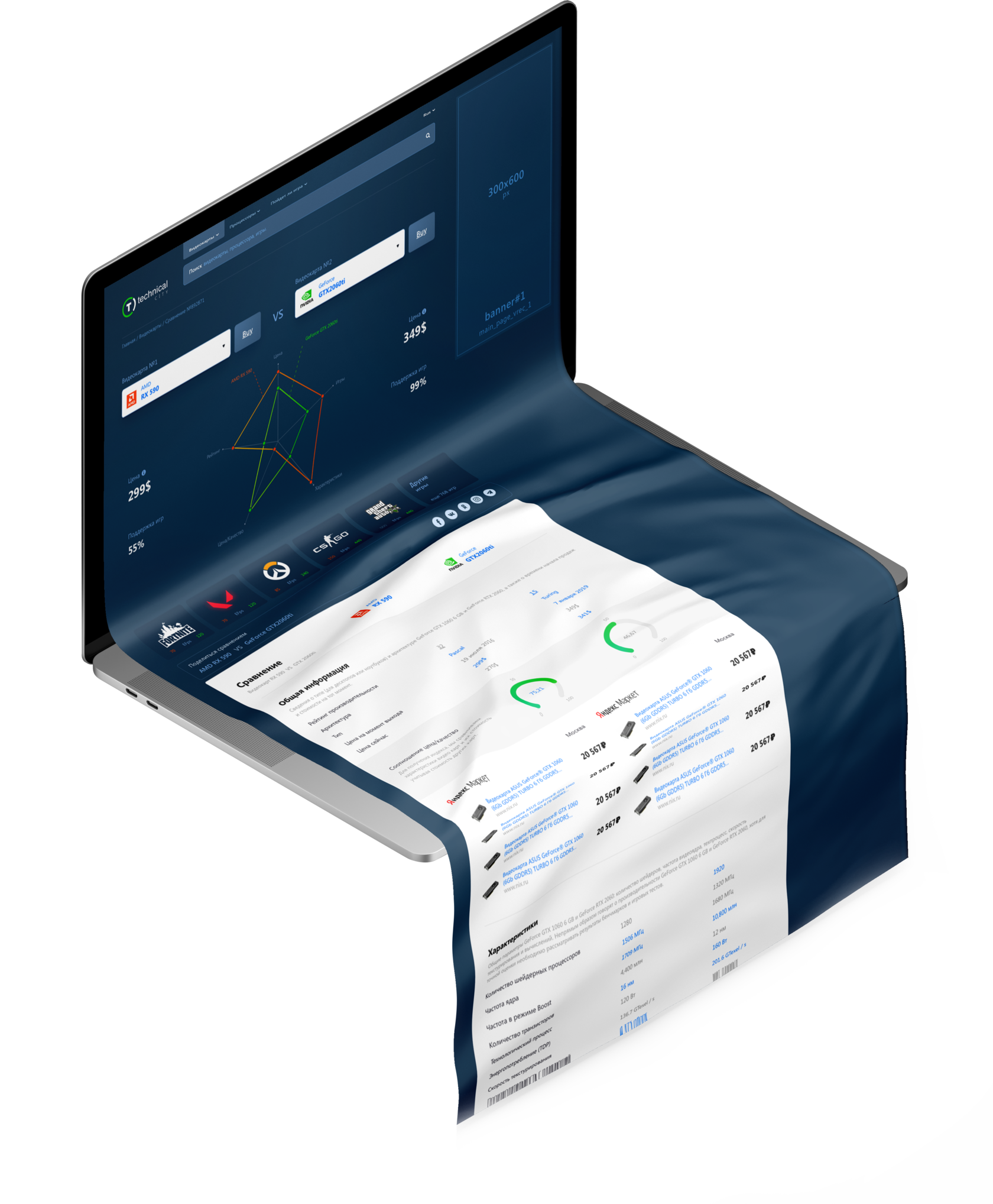
Technical City help you make a purchase decision, compare graphics cards or processors with one another, or simply have fun looking at the features or just have fun looking at the features and technology.

The task
and result
and result
The Task
The classic version of the website was made by the guys themselves brick by brick, with "emergency" design solutions added at times of urgent need. As a result, over several years, the appearance and usability of the portal became... contentious.
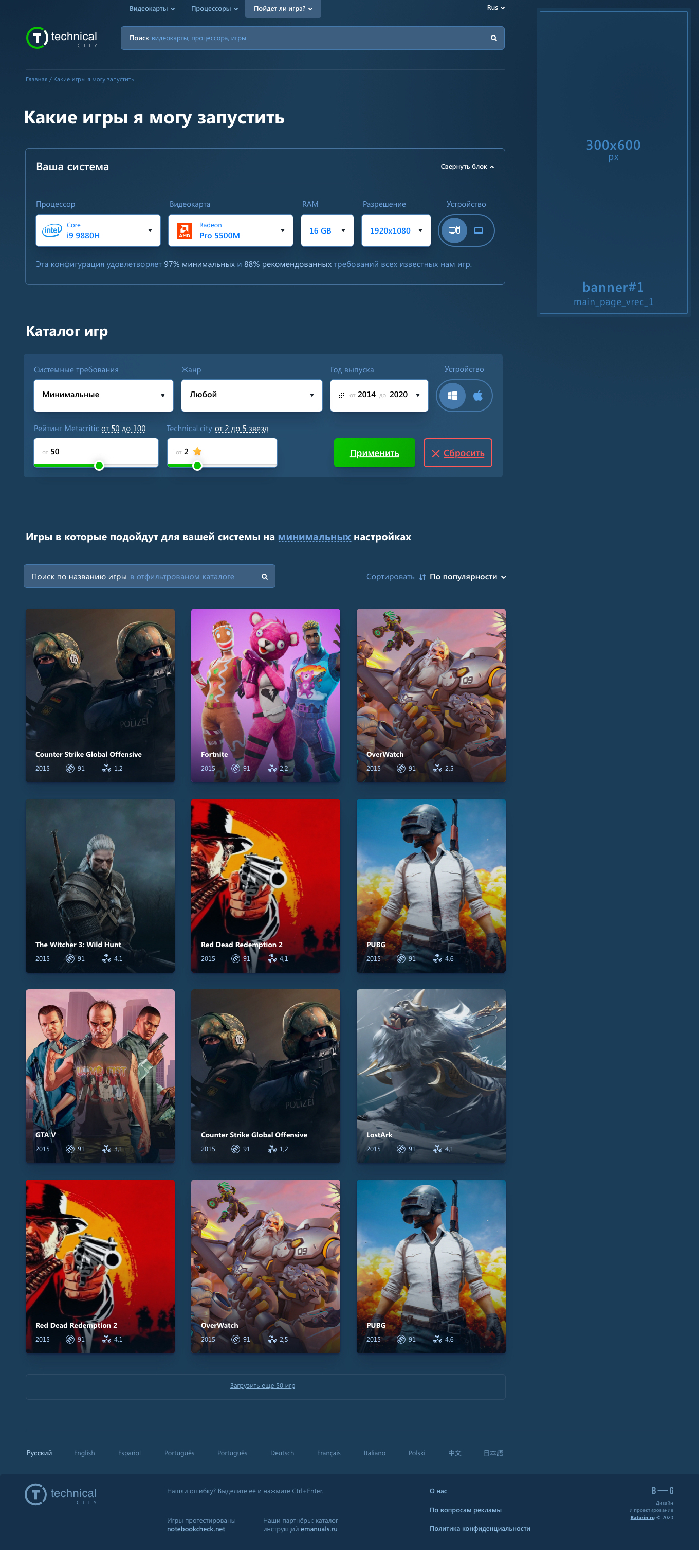
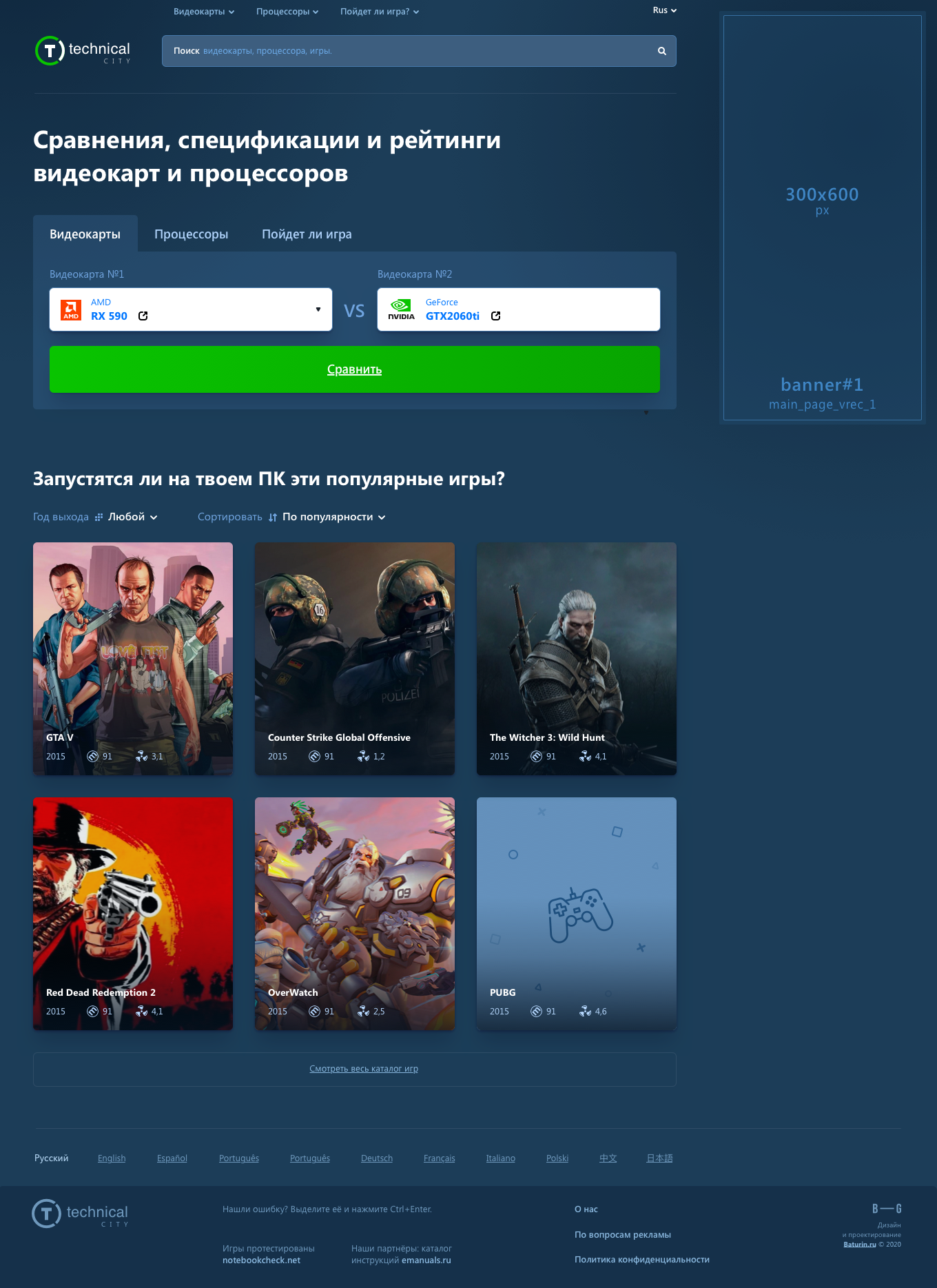
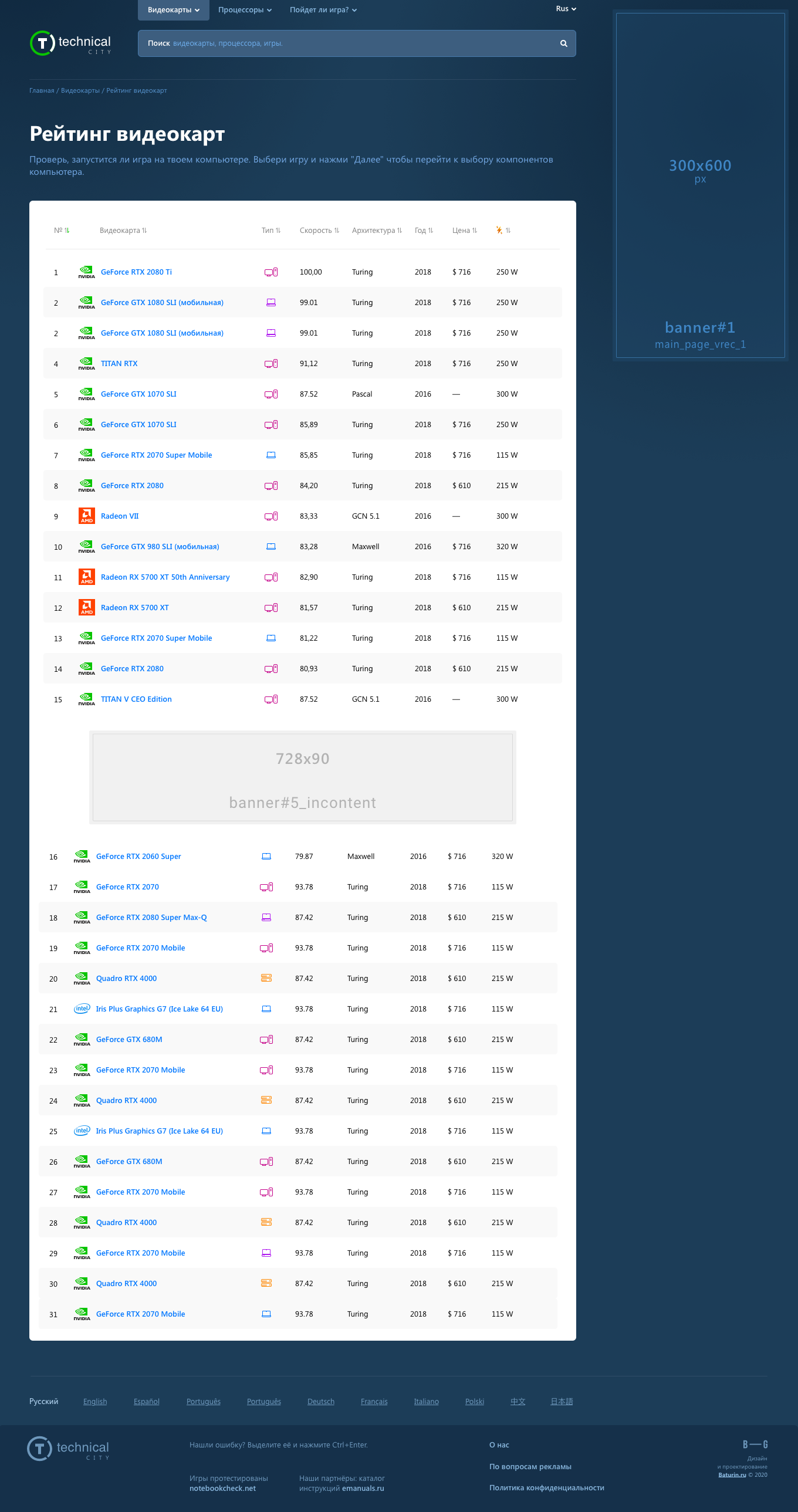
We rethought the visual concept, came up with simpler mechanics for using basic functions, while still being able to keep the old habits for regular visitors. Not only has the portal become more enjoyable to use, it has become visually memorable, which leads to an increase in loyal audiences.
The Result


